
Making SilverCloud mobile-first
SilverCloud is a digital mental health platform that was originally and primarily designed for desktop
By adopting a mobile-first approach with personalised features and an intuitive design, we created a seamless and accessible experience tailored to users' mental well-being
UX DESIGN
•
UX RESEARCH
•
UX DESIGN • UX RESEARCH •

The Problem
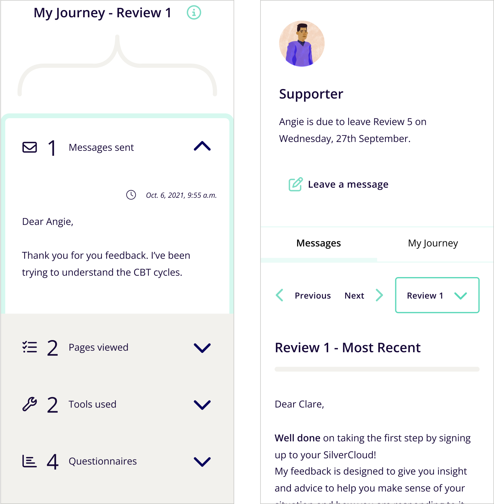
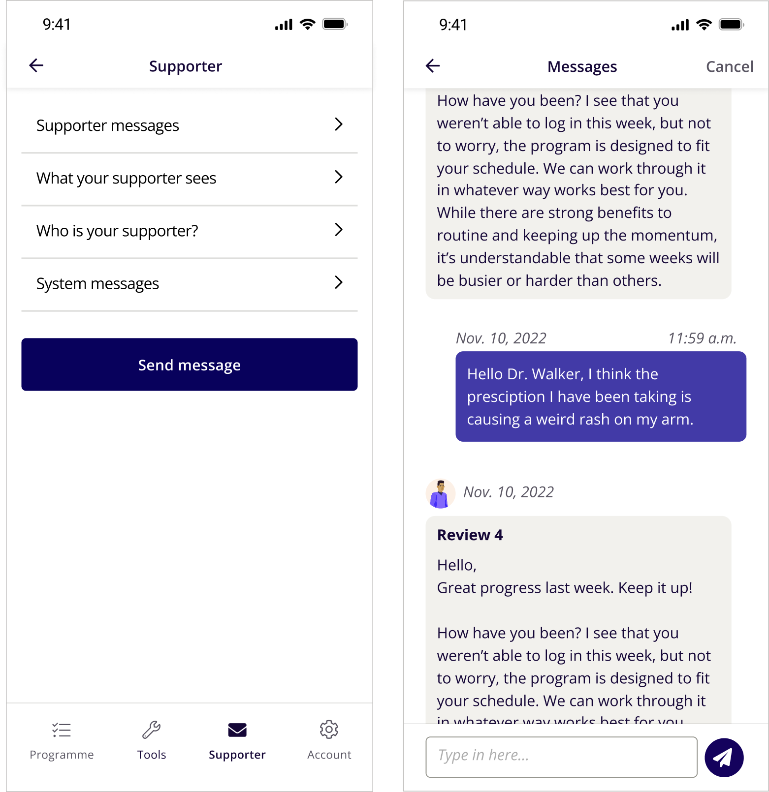
Over 70% of our users were using mobile devices to access their programs. SilverCloud was specifically designed for desktop so a larger intervention was required rather than simply updating the UI to fit smaller screens
The Goal
Improve the user experience of the SilverCloud platform for patient users
Pain Points
Non-native styles
Inconsistencies and too many patterns
Usability issues
Lack of mobile QA
THE FOCUS


1.Tools
2. Design System


3. Accessibility
4. Pattern optimisation
WHAT WE DID
1. CREATED A TOOL FRAMEWORK
What is it?
Checklists for designers when researching and designing tools
A high level description of what SilverCloud tools are
Repository of tool patterns and examples
What does it cover?
Tool data
Core tool Patterns such as serial entries and progressive disclosure
Core Tool (re)design processes
Tool Principles
What is the purpose?
To classify tool types:
for internal alignment
for scalability
To help with decision making on prospective tools
To help with the design or redesign of tools
RESULT
— A validated framework for the design of interactive tools in SilverCloud
Guidelines which map out best practice, key effective attributes, relevant design patterns and associated attributes of deployment
A better understanding of what is most valuable to all stakeholders, allowing for strategic optimisation
Mapping of how the different tools fit into clinical pathways and user journeys
Internal alignment on our strategy around tools
A process for justifying the build of a new tool
Identification of a sub-group who rely on clinical tools rather more than the program content
2. CONSOLIDATED OUR DESIGN SYSTEM
What is the purpose?
Ensures we retain our brand identity through our designs
Creates a cohesive and consistent user experience
Fosters collaboration between designers and developers
Faster iteration & scalability options
Improved accessibility to help maintain compliance with WCAG standards
Minimises redundant work
Ensuring the inclusion of new mobile patternsMinimises redundant work
RESULT
— The integration of SilverCloud’s Design System with our Figma Component Library
As a small design team with ownership of the Figma components alongside the developers we worked on ensuring that our two libraries were up-to-date with the relevant patterns
Most patterns were overhauled from predominantly desktop to mobile including usage guidelines and rules of interaction
We worked closely with developers to ensure that the patterns we designed would work in multiple instances across the platform which strengthened our relationship while also giving us a better understanding of how each team works and thinks
3. ACCESSIBILITY
What was our objective?
Update colour variables to reduce colour contrast accessibility issues
Ensure that users have accessible versions of the first 5 high priority UI elements:
Subtopic accordions
Dropdowns
Cards
Buttons
Tooltips/How-to’s
— An updated library of UI elements incorporating a new, accessible colour scheme
Our previous colour scheme did not pass accessibility so in tandem with creating new/improved mobile patterns we decided to completely overhaul our colour system
We considered different user groups (audio or visual impairments, learning or cognitive diffiulties- and designed with those in mind:
Design with higher colour contrasts on design elements throughout
Those with colour blindness, specifically red/green, may struggle to differentiate between certain icons within tools so colours were updated to minimise this risk
Provide audio options for modules along with transcripts for videos/animations
Ensure compatibility with screen reader functionality (particularly on our questionnaires)
Work closely with the content team to ensure plain language is used throughout the programs
RESULT
4. PATTERN OPTIMISATION
The changes

RESULT
— Industry standard patterns throughout the product
Old Designs
New Designs
THE OUTCOME
Comparing these scores using a post-release heuristic evaluation gave us valuable insights into how well the implemented changes have addressed the previously identified issues
FINDINGS
15% increase in satisfaction across regions
Strong evidence of substantial progress
Notable improvements in statistical means point to a reduction in the number and severity of usability issues
A more seamless user experience
USER FEEDBACK
I like the changes made to SilverCloud. It is much easier and straightforward to use
Layout is great
I think it's better to look at and clearer with darker lines and more prominent designs. It was a bit too light coloured before and faint lines.